09.01.2026.
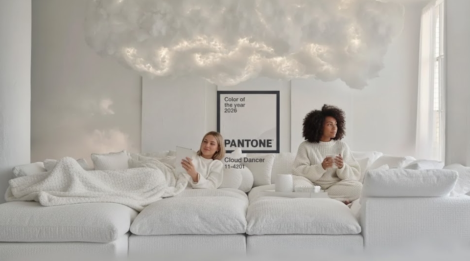
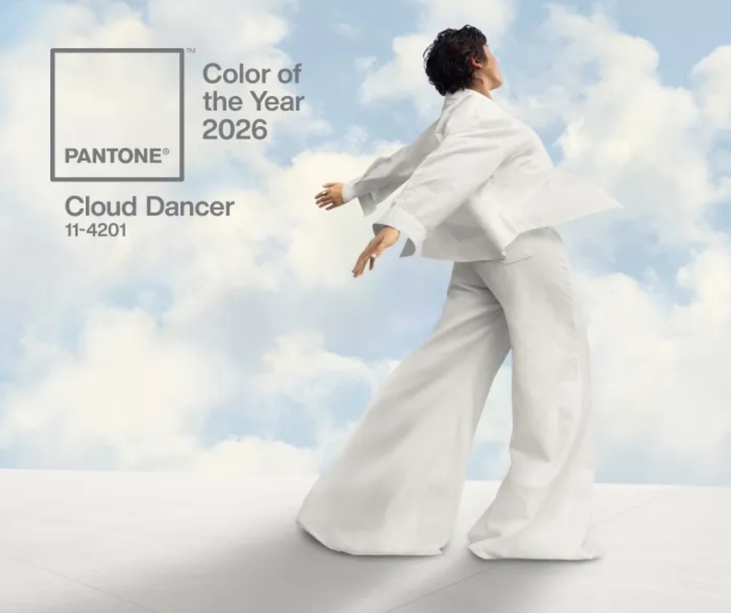
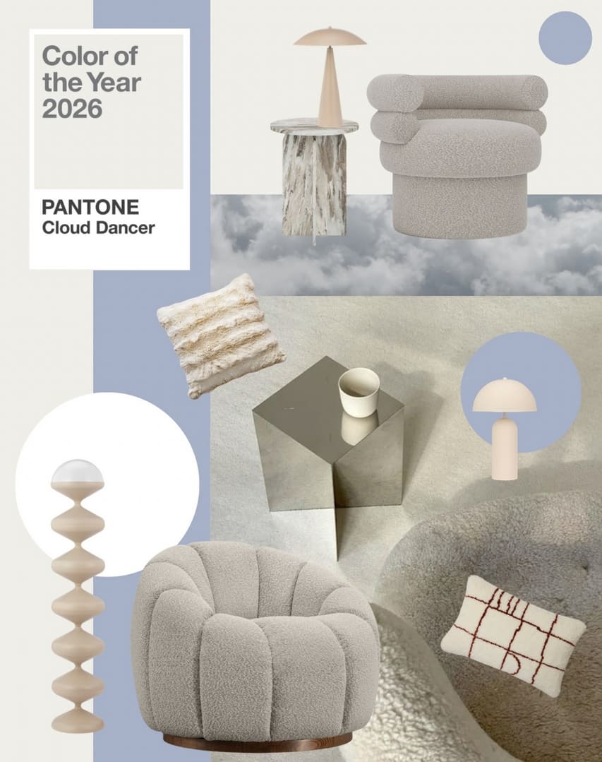
This year, Pantone has chosen Pantone 11-4201 Cloud Dancer as the Color of the Year for 2026. Read on to discover more about Cloud Dancer and how to incorporate this serene white into your interior design!
Characteristics and Mood of Cloud Dancer
Cloud Dancer is a soft, warm white that embodies calm, lightness, and balance. Unlike classic cool whites, which can feel sterile and distant, Cloud Dancer carries warmth, making it visually inviting – especially in spaces where comfort and harmony matter.
This tone brings a sense of airiness and spaciousness to any room, allowing light to reflect freely and distribute evenly. Emotionally, Cloud Dancer soothes, helps create an organized environment, and reduces visual noise. This is why it’s considered an excellent foundation in interior design – a color that easily adapts to various styles, materials, and lifestyles while remaining timeless.
Why Cloud Dancer is the Color of the Year
Pantone selected Cloud Dancer for 2026 because it offers a quiet but highly relevant response to today’s oversaturated and noisy world. This airy, gentle white symbolizes peace, clarity, and mindful simplicity at a time when we increasingly seek moments to pause, focus, and reconnect with ourselves.
Cloud Dancer acts like a blank canvas – helping shed outdated thinking and making room for new ideas, creativity, and bold solutions.
Cloud Dancer in Interiors: Current Design Trends
Contemporary interior design emphasizes intentional simplicity, natural materials, and emotional comfort. Designers are moving away from fast-changing trends, focusing instead on sustainable solutions, quality materials, and spaces that enhance well-being.
Less Contrast, More Calm
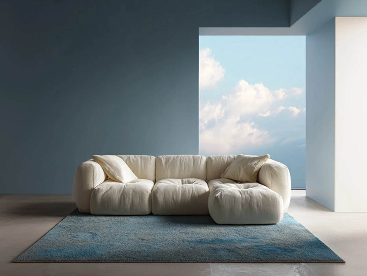
In modern interiors, this warm white blends beautifully with clean design lines, built-in furniture, and a minimal color palette. In 2026, visual calm is in style – fewer contrasts, more nuanced transitions, and layered tones. Cloud Dancer provides the perfect foundation, allowing spaces to feel airy without being cold.
Scandinavian Design and Sustainability
In Scandinavian style interiors, which continue to embrace sustainability, Cloud Dancer pairs perfectly with natural materials – light and mid-tone woods, limestone, clay, linen, and wool. This year, matte and tactile surfaces are particularly on trend, and Cloud Dancer enhances these textures rather than overpowering them.
Minimalism and Quiet Luxury
In minimalism and quiet luxury concepts, Cloud Dancer serves as a refined background. In these interiors, the focus is on proportions, material quality, and precise detailing rather than decor. The airy white highlights solid wood textures, stone surfaces, matte metals, and glass while maintaining lightness and balance.
Cloud Dancer also allows furniture to take center stage as key elements, emphasizing their form, functionality, and material quality.
Cloud Dancer in Offices
In office environments, Cloud Dancer creates a calm, focused, and visually organized atmosphere – particularly relevant for modern work cultures. This warm white reflects light, brightens the space, and makes it feel larger without feeling cold or sterile. It works perfectly as a wall color or as the main tone for large furniture pieces, such as built-in cabinets.
Cloud Dancer with Other Colors
Cloud Dancer pairs especially well with natural earth tones – sand, clay, warm grays, and wood hues – creating a balanced, peaceful atmosphere.
It also harmonizes beautifully with last year’s Pantone Color of the Year, Mocha Mousse – a warm, deep brown that adds stability and coziness to interiors. While Cloud Dancer acts as an airy, neutral background, Mocha Mousse brings depth and a grounding presence.
In modern interiors, Cloud Dancer elegantly contrasts with deep accent tones like graphite, charcoal, or navy, while blending effortlessly with pastels and muted greens. This versatility allows for nuanced, contemporary combinations without sacrificing visual lightness and clarity.
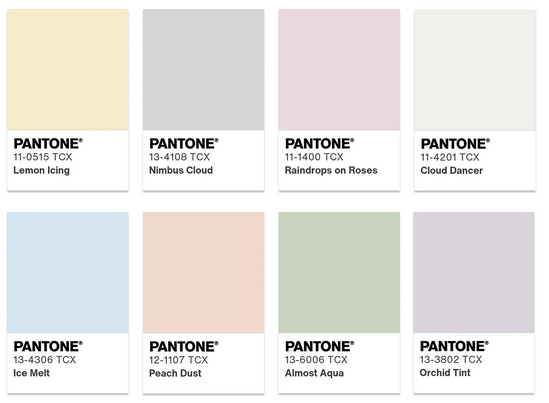
Color Palettes Featuring Cloud Dancer
Pantone has created several color palettes that highlight and complement Cloud Dancer. Each palette has its own mood and character – just choose the one that suits your space best!
Powdered Pastels
Pastel and neutral tones pair beautifully with Cloud Dancer, creating subtle, pleasant, and understated transitions.
Take a Break
This palette inspires playful experimentation with hues – from sparkling pinks and oranges to warm caramel and cocoa shades – creating a lively and cheerful color story.
Atmospheric
Cloud Dancer brings airiness and lightness, opening up space for soft, muted blue-green tones and gently illuminated accents.
Comfort Zone
These natural, warm tones create a soothing environment – a perfect place to relax and unwind.
Tropic Tonalities
Cloud Dancer balances and complements bright tropical shades – turquoise oceans, sunny citrus hues, and vibrant exotic colors.
Light & Shadow
Soft tones dominate this palette, creating a delicate contrast between light and shadow.
Glamour & Gleam
Cloud Dancer creates an elegant contrast with black, enhanced by warm reds, wine tones, smoky turquoise, and silvery accents – resulting in a luxurious and sparkling palette.
Conclusion
Cloud Dancer is more than just a color – it’s a mood that brings calm and elegance to any space. Try this warm white in your interior and let your rooms breathe, inspire creativity, and serve as a harmonious backdrop for any style!

Stay updated with the latest industry trends and discover about special offers and discounts!
 all
all Cabinets and shelves
 Acoustics solutions
 Built-in furniture
 Tables and reception desks
 Chairs and sofas
 Office equipment
 Metal furniture
 For educational institutions
 Hotel furniture
 For museums and repositories