10.12.2023.
Our homes and workplaces reflect our personalities. Color is a powerful tool that allows us to create atmosphere and mood in a room. Let's explore how color theory can help you choose the perfect shades and what colors are relevant in modern interiors.
Color Theory
People have been familiar with color theory for several centuries, and it is used in practice every day by various representatives of the creative industry: painters, designers, photographers and others. Interestingly, color theory was created not by artists like Leonardo da Vinci or Rembrandt, but by the well-known scientist-physicist Sir Isaac Newton. Newton used a glass prism and observed how a ray of sunlight split into the colors of the rainbow. Using this information, he created the color wheel, which is the very basis of color theory.
Colors on the color wheel
The primary colors are red, yellow, and blue. These are the colors that form the basis for all other colors. These three colors cannot be made by mixing other colors. On the contrary, mixing any two of these primary colors produces secondary colors.
The secondary colors are orange, violet, and green. By mixing a secondary color that is adjacent to the primary color on the color wheel, the tertiary colors are yellow-green, blue-green, blue-violet, red-violet, orange-red, and yellow-orange.
Warm or cold, light or dark
Colors are divided into warm and cool colors. Warm colors are those that are closer to yellow and red on the color wheel, while cool colors are those that are closer to blue. “Warmness” or “coolness” is determined by how much yellow (for warmth) or blue (for coolness) is mixed into the color in question. Color tones are determined by how light or dark a color is. This is created by adding black or white. Black makes any color darker, while white makes it lighter and duller.
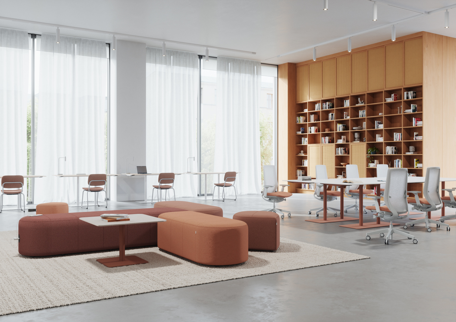
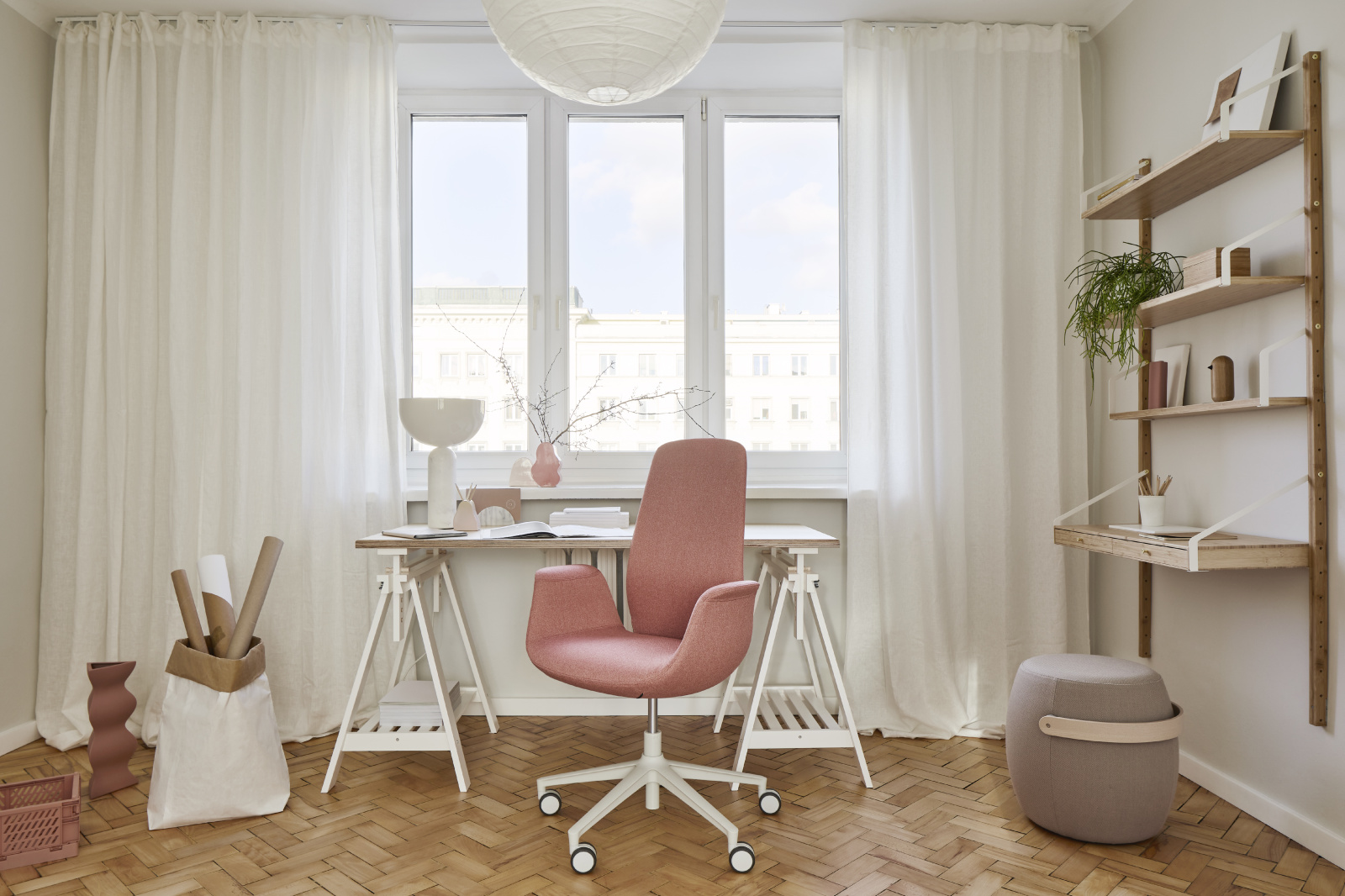
Color schemes in the interior
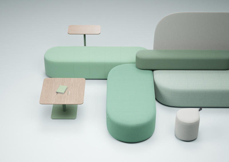
A monochromatic color scheme is obtained by using one color and various shades and hues of this color. For example, dark blue, light blue, very light blue, and so on. For a monochromatic color scheme to look good, it is important to choose one shade of blue and stick to it. So, all light and dark shades are derived from one color, supplemented with an admixture of white or black.
A completely monochromatic color scheme in the interior will create an unnatural and unusual feeling - imagine all the furniture, walls, ceiling and interior items in one color! Although it can be a great place for a photo shoot, in rooms that are planned to be inhabited, it is recommended to combine the monochromatic color scheme with another neutral shade, for example, white, beige, black, wood brown, and so on.
To create a balanced interior, one option is to stick to one type of tone – either warm or cool.
Dark colors in small doses can bring a pleasant balance and coziness to the interior. However, it should be noted that in large areas, dark colors can create a feeling of heaviness and visually reduce the space. Colors such as dark brown, dark gray, dark blue and dark green are also good choices for a dark accent.
Complementary colors are two opposite colors on the color wheel. Complementary colors are, for example, yellow and purple, red and green, orange and blue. Complementary colors work great as accents in the interior. They add liveliness and energy to the interior. These colors can create a very intense atmosphere in the interior, in which it can be difficult to relax, so for a harmonious feeling, it is advisable to use complementary colors thoughtfully and in small doses.
Light colors, on the other hand, bring more light into the interior and visually expand the space. For this purpose, you can use both white and other light shades, such as light yellow, light pink, light green, light blue, and the like. Light colors will create an uplifting and light atmosphere in the room in terms of feeling.
60-30-10 rule
In interior design, the 60-30-10 rule is often used when choosing colors to create a balanced and cozy atmosphere. The first number – 60 – denotes the main color that will dominate the interior. This color contains the largest elements in the room, such as walls, a sofa, a carpet, furniture, and the like. The next number – 30 – denotes the secondary color. It will be much less in the interior than the first, but still in a sufficiently large volume. This color could be, for example, one of the pieces of furniture, an armchair, a carpet. In turn, the last number – 10 – denotes the accent color. It is a color that adds energy to a space and will appear in small amounts. It can be found in decor and other small elements.
Natural elements
In the interior, there are also shades that are not in the color wheel, but are found in nature. For example, various metals - gold, silver, bronze. Wood is also an element that is widely used in the interior, for example, for making furniture. Depending on the type of wood, its shade will also be different. Currently, it is popular to use natural stones in the interior, which bring various gray and other shades into the interior.
When using natural elements in the interior, you should look at their undertone, for example, gold has a yellow and warm undertone. Accordingly, gold will fit well into the color range of warm tones.
Current color trends in the interior.
Not only our lifestyle and needs change every year, but also our taste. From beauty and functionality to personal self-expression, colors play a significant role in interior design. Here's what will be relevant next season!
Nature-inspired colors
Increasingly, natural elements are entering the interior – houseplants, stone surfaces, linen, shells, wooden furniture and other interior items made of wood. This will also be seen more and more in the choice of color scheme in 2024 – green, brown and beige tones will be very popular and can be found in many interior designs.
It is very easy to indulge in this interior trend – all you have to do is use materials in their natural color and shape in the room design. For example, unpainted wooden furniture can be a great choice to bring more natural elements into the room. The feeling of naturalness in the kitchen can be well strengthened by using a built-in kitchen system in natural colors, while a built-in wardrobe in a natural wood color in the bedroom can be a great addition to the rest of the wooden furniture in the bedroom.
Choosing colors for your interior is both an art and a science. By using color theory and researching compatible shades, you can create a space that not only looks aesthetically pleasing, but also meets your personal (or business) expectations. Current color trends can provide inspiration and new ideas, but remember that the most important thing is to ensure that the interior is cozy and appropriate for the functionality of the space.


Stay updated with the latest industry trends and discover about special offers and discounts!
 all
all Cabinets and shelves
 Acoustics solutions
 Built-in furniture
 Tables and reception desks
 Chairs and sofas
 Office equipment
 Metal furniture
 For educational institutions
 Hotel furniture
 For museums and repositories